


I just read Cory Doctorow’s wonderful Outspoken Authors book The Great Big Beautiful Tomorrow. You can buy it or download it for free from Cory’s site. If you look around, you can even find a series of podcasts of Cory reading it.
This slim volume includes an essay, an interview, and Cory’s novella, “The Great Big Beautiful Tomorrow.” I really enjoyed this tale—it’s modern, au courant, conceptually postsingular. One of the more interesting themes in SF these days is how life will be if and when we really get control over biotechnology in a really big way—big enough to use biotech to achieve the old goals of nanotechnology. Another theme is how things will be when we get a planetary networked computation that evolves into something like a local god.
One perennial topic in postsingular tales is how it might be to live within a “Vearth,” that is, to live as an more-or-less autonomous computational agent within a vast virtual-reality emulation of Earth. Some writers view this as a good thing, others not so much.

I think I’m not giving too much away if I say that at some point within Cory’s “The Great Big Beautiful Tomorrow,” some creatures called wumpuses are disassembling chunks of our planet and coding up the information patterns found within.
And at one point a character is living in a virtual reality that embodies the wumpus-extracted info. The Vearth-like computational engine has some bugs in it, but the character feels like it might be fun to carry on his life in there anyhow. Not that this person has much of a choice…
I tend to have persistent doubts that a world-sized VR could ever match real reality—or that there would ever be much point in trying to create it. And I’m going to explain my reasons below.
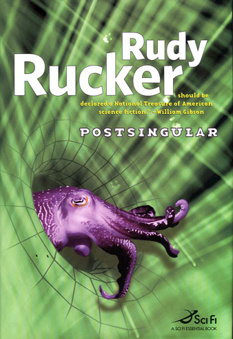
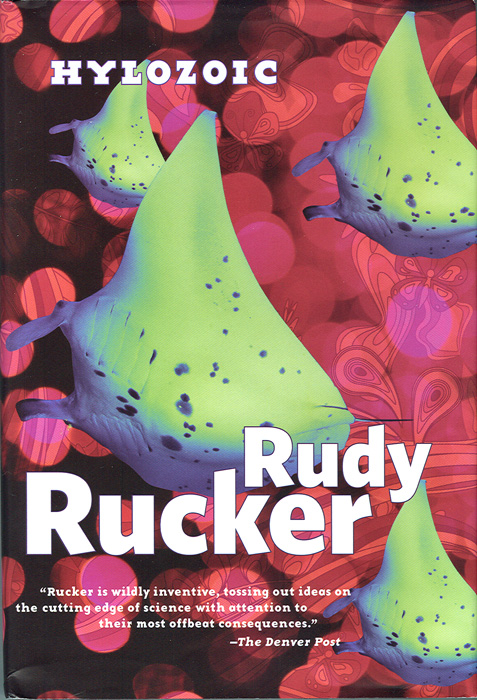
In 2007 and 2009 I published my pair of novels, Postsingular and Hylozoic, which took on some of these same ideas.
So now I’ll tell you a few of my thoughts, relating them to Cory’s novella. By the way, I published some of today’s rap in 2008, in a blog post called “Fundamental Limits to Virtual Reality,” . But I’m reposting them today in a re-edited form, fitting them to the flow of Cory’s novella.
So okay, let’s start. The first thing to keep in mind is that physical matter, just as it is, carries out outlandishly complex chaotic quantum computations by dint of sitting around. Matter isn’t dumb. Every particle everywhere and everywhen computes at the max possible flop. I think we tend to very seriously undervalue quotidian reality.
So there’s no reason to assume that a digital version of the world is in any sense “better.” Turning an inhabited planet into a VR simulation might be comparable to filling in wetlands to make a mall, clear-cutting a rainforest to make a destination golf resort, or killing a whale to whittle its teeth into religious icons of a whale god.
Advocates of the virtual-Earth scenario like to claim that nothing important need be lost when Earth is pulped into bits and bytes. Supposedly some vast computer network can run a VR simulation that’s a perfect match for the old Earth. Call the new one Vearth. But it’s not likely the match will be satisfactory.
Let’s take a moment to discuss the problems with trying to replace real reality with virtual reality. We already know that our present-day videogames and digital movies don’t fully match the richness of the real world. What’s not so well known is that no feasible VR can ever match nature because there are no shortcuts for nature’s computations. A VR simulation of Earth can only work if the simulation is running on a “computer” that’s about the same size as Earth was in the first place.

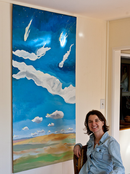
[Repousse medallion by Isabel Rucker.]
This is a limiting property of the natural world related to what I call the “Incompleteness Theorem for the Natural World.” The limitative aspect of the natural incompleteness theorem is that fully simulating a bunch of particles for a certain period of time requires a system using about the same number of particles for about the same length of time.
Putting it differently, naturally occurring systems don’t allow for drastic shortcuts. This means that if you build a computer-simulated world that’s smaller than the physical world, the simulation cuts corners and makes compromises, such as using bitmapped wood-grain, linearized fluid dynamics, or cartoon-style repeating backgrounds. Smallish simulated worlds are doomed to be dippy pseudo-environments populated by simulated people as dull and predictable as characters in bad novels.
But wait—if you get, let’s say, a race of Cory’s “wumpus” devices to repurpose a whole planet into computers, then you do have potentially as much memory and processing power as the old intact planet possessed. It’s the same amount of mass, after all. So then we could make a fully realistic world-simulating Vearth with no compromises, right?

Well, there’s another problem here. Maybe you can get the hardware in place, but there’s the vexing issue of software. Something important goes missing when you smash Earth into dust: you lose the information and the software that was embedded in the world’s behavior. An Earth-amount of matter with no high-level programs running on it is like a potentially human-equivalent robot with no AI software, or, more simply, like a powerful new computer with no programs on the hard drive.
Ah, but wait, Cory has a fix for this too. The wumpuses are going to copy all the patterns and behaviors embedded in Earth’s biosphere and geology, copying everything before they munge it into fodder for the Big Hack. The wumpuses record the forms and processes in every blade of grass, in every bacterium, in every pebble—like Citizen Kanes bringing home European castles that have been dismantled into portable blocks, or like foreign tourists taking digital photos of the components of disassembled California cheeseburgers.
Well, maybe this could work, but now we get to the issue of…why bother? If you want to smoothly transmogrify a blade of grass into some nanomachines simulating a blade of grass, then why bother grinding up the blade of grass at all? Keep in mind any object at all can be viewed as a quantum computation. The blade of grass already was an assemblage of nanomachines emulating a blade of grass. Nature embodies superhuman intelligence just as she is. So there’s not much point in making Nature into a copy of herself.

The long-term prospect I see as more attractive is one where, instead of turning nature into chips, we’ll turn chips into nature. I’m talking about the withering away of digital machines and the coming of truly ubiquitous computation. A Great Awakening.
The Great Awakening will eliminate nanomachines and digital computers in favor of naturally computing objects. We can suppose that our newly intelligent world will, in fact, have some “anti-wumpuses” to crunch up the digital machines, frugally preserving or porting all of that digital data, saving it as tastes, colors, smells, breezes, flames, and flows of water.
And then we’ll be able to tune in telepathically to nature’s computations. We’ll be able to commune with the souls of stones.
When you get right down to it, everything is alive. But Cory already knows this. What makes “The Great Big Beautiful Tomorrow” so engrossing is that, more than being about tech, it’s about the emotions and the personal growth (or lack thereof) of several inextricably linked human beings. That’s the beating heart of the story, an ingredient that an SF writer can all to easily forget too include! The human wheenk.