


The ripping-vinyl-to-iTunes process has two main stages.
(1) Getting the info off the viny disks and into mp3 files.
(2) Importing the mp3 files into iTunes in a usable form.
Here are the links to my old (but recently revised) posts on this.
(1) “Ripping Vinyl to MP3s for iTunes”
(2) “Managing Music in iTunes”
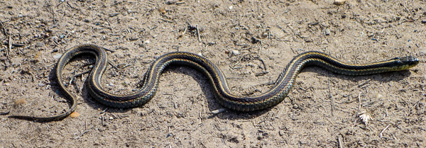
Taming those wiggly audio wave forms.
By the way, the second post can be useful whether or not you’re in fact ripping from vinyl—it has some good info about making iTunes more transparent and more accessible to your control.
Context?
I just finished writing an SF story called “Laser Shades” for an interesting book project, The Superlative Light, by the photographer Robert Shults. Shults got some good funding for his book, and I think it’ll come out in late 2014 or in 2015. Eventually I’ll post my story where you can see it too.
In any case, I have a little free time just now, so I went back to a kind of obsessive time-wasting project that I was into back in 2011: ripping some of my old vinyl records to MP3 files that I can load into iTunes and copy to my smart phone.
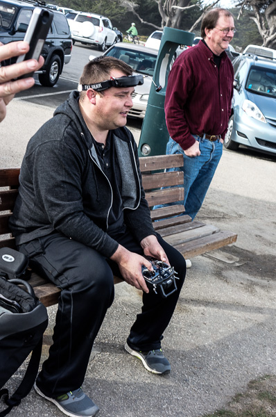
[A happy hacker using VR goggles to guide a little camera-equipped drone helicopter around Steamer’s Lane in Santa Cruz.]
In 2011, I wrote those two blog posts describing how I’m doing this, and I linked to them at the start of today’s post. I’ve found it’s important, when I’m doing something ultrageeky, to write down what I did—because this is the kind of info that I tend to forget in a few months, and certainly in a few years. Learning how to do something intricate on a comptuer is like learning all the part-numbers for a 1975 Ford Galaxie carburetor and memorizing the thing’s little manual. Impossible to retain.
[Just before midnight on New Years Eve in Pinedale, Wyoming! (Lo-res smartphone photo.)]
So I went back and found my two old webpages, and used the info, and upgraded it a little bit. And here, for your own use are the links to those pages. My two prereqs for the software tools I used were
* To find free, reliable, non-malware-type software to do what I needed, and
* To be able to use the software pretty easily.

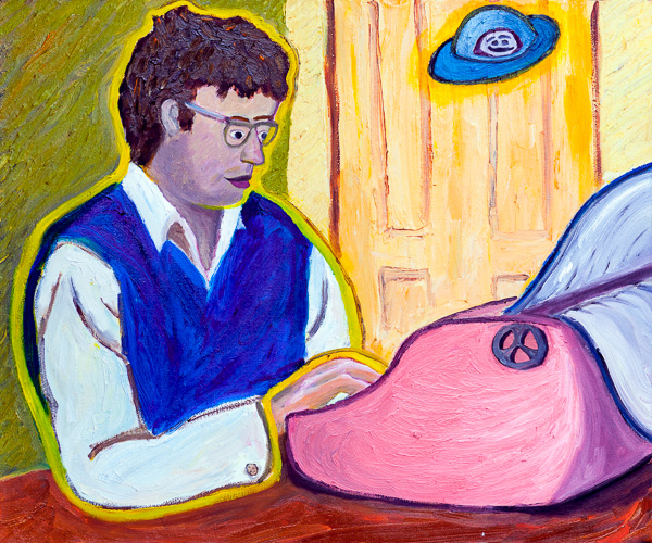
[My 2013 painting “Fractal Skate Posse,” see my paintings page for info, prints and my Jan-March 2014 show at Borderlands in SF.]
I’m a Windows user, so some of the wares I found are in fact available only for Windows. Finding good free software for the Mac OS can in some cases be a little harder, but if you know of some, do put a comment on this page or on the pages I’m directing you to.
One final note on this issue—by “free” software, I don’t mean commercial software that comes with a “free trial” which a crippled, or partly disabled, or money-begging mode—or outright malware! “Free” means solid, programmer-written wares that you find on a reliable programmer-run site like Sourceforge.
So now dig out that crufty old turntable and rescue such massive gems as Ton-Loc’s “Wild Thing,” simple as wallpaper but somehow quite wonderful.


