I was in the good old Museum of Modern Art in New York last week, the real MOMA. On the fifth floor they have modern art from 1880 ”“ 1940, on the fourth floor the art from 1940- 1970, and on the second floor the contemporary art.
I prefer the fifth floor, that is, the early modernist stuff. The thing is, I prefer paintings, with colors, and without words written on them.
Pop Art does have colors, but as the decades go by, most of the work looks increasingly thin—although, to my eye, Rosenquist still holds up. The post-Pop artist Basquiat still looks pretty good, although, again, at least for me, any painting with words written on it is less interesting that it would have been without the words. And Philip Guston is still great, and even Rothko holds up, if you give him time to sink in.
There are some great contemporary artists as well, but none of seemed to be on display in the MOMA last week. All they had was the middle range of contemporary art. In the future, I can’t imagine that anyone at all will be looking at these beige, white, and gray works. There’s no eye candy, no thought or too much thought, and little evidence of craft or sustained effort.

[Detail of Vincent van Gogh, “L’Arlesienne”]
Why has Western art gone in this direction? One factor is our capitalist conception that last year’s model is obsolete, and this year’s model has to seem new and different. We take this for granted. But keep in mind that other cultures are comfortable with having artists and craftsmen stick to certain standard forms, continually refining and improving on what’s gone before. Would it be so bad to try and paint like Picasso or van Gogh or Thiebaud? Or maybe some people are doing that, and the fire just isn’t there?
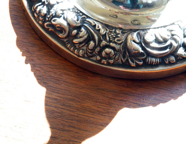
The down side of the traditionalist slow refinement model is that you end up with, like, a museum filled with paintings of the Crucifixion, or with endless calligraphic scroll paintings of mountain trees in fog.
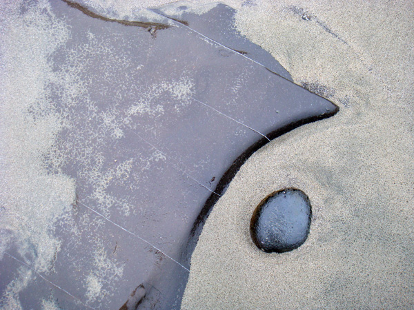
But, as I was saying, the down side of innovation for innovation’s sake is that you end up discarding too many valid modes of artistic expression. And somehow—I’m not sure why—you end up with beige, brown, and black paintings with words on them. And little piles of garbage here and there. “Sculptures.”
Of course Tom Wolfe said all this years ago in his 1975 book The Painted Word. Nobody listened to the old fuddy-duddy.
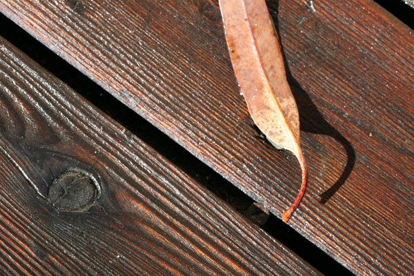
Is there another path for new art other than discarding everything that was good about painting? Well, sure, you can use entirely new media. And this is where video art, or interactive computer art comes to the fore.
Generally I don’t like video art—it takes a long time to look at it, and it makes noise that spills over into the other parts of the museum, unfairly weakening the effects of the other works of art on display.
But at the MOMA I did see a very impressive video piece by Pipilotti Rist at the MOMA—I’ve seen her work before. She’s cool.
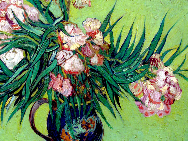
[Detail of a Metropolitan Museum of Art painting by Vincent van Gogh]
But nobody touches Vincent.





January 13th, 2009 at 8:59 am
old fuddy-duddy is right! LOL. Maybe there should be mandatory contemporary art appreciation for senior citizens! 🙂
January 13th, 2009 at 9:04 am
I second the recommendation of Tom Wolfe’s _The Painted Word_. It’s a short book packed with ideas. If you’re trying to figure out why modern painting wound up the way it did, Wolfe will tell you.
Wolfe also did a companion book called _From Bauhaus to Our House_. Before WW2, Western civilization was able to build buildings which were a pleasure to look at, work in or live in. After WW2, somehow it became impossible to erect anything that wasn’t either ugly and drab or weird and impractical. Wolfe tells how and why we got into this predicament.
January 13th, 2009 at 9:23 am
It’s funny, because I was just reading a book about minimalist artist Robert Irwin, and thinking that you would really dig it. I think his work is beautiful and very satisfying.
Otherwise, I pretty much agree with you, except that I love paintings with words. It’s the sentences I can’t stand. (Jenny Holzer should be beaten with a thesaurus, IMHO.)
January 13th, 2009 at 3:30 pm
COOP, I like Irwin’s stuff okay, in a science museum kind of way. Sol Lewitt is a minimalist I like a little better.
As for words in visual art, I always think of what Beavis and Butthead would say when a music video had writing in it: “Words suck.” In the visual art context, words seem too cheap and easy, also they come from the non-visual half of the brain which seems jarring. I don’t recall any words in YOUR paintings!
I was looking at the van Goghs in the Met on my trip too. Those colors! And, ah, Georgia O’Keeffe.
Old fuddy duddy that I am…
January 13th, 2009 at 3:50 pm
Tom Wolfe also has a great chapter on Frederick Hart in his book _Hooking Up_. It’s very much the conflict between craft and the “little evidence of craft” you mention, especially when he discusses the Vietnam memorial.
“Imagination without skill gives us contemporary art” – Tom Stoppard
The van Gogh museum in Amsterdam is my favorite art gallery in the world. Nothing comes close to that place.
An Andrew Wyeth exhibition just opened here in Nagoya, that should be good…
January 15th, 2009 at 1:14 pm
I dropped out of being an art major in the seventies for most of the above reasons, plus I’m a crappy draftsman. Daub something and give it a title like MAN’S DILEMMA, and you’re an artist. Now computers have opened up doors that weren’t even invented then, and I make stuff again.
January 15th, 2009 at 4:11 pm
I always loved Kenneth Patchen’s picture-poems. New Directions just put them out in a new collection with a preface by Jim Woodring:
http://www.amazon.com/Walking-Away-World-New-Directions-Paperbook/dp/0811217574/ref=pd_bbs_sr_4?ie=UTF8&s=books&qid=1232064624&sr=8-4
January 16th, 2009 at 11:43 am
Philip Guston IS still great. I also agree with you about the words on paintings. If a picture is worth 1000 words, I think anything with 1002+ is crowded. Sometimes I swear the only way to make art better is to regress a little bit. Creating art in a new way just because you can, at least in my opinion, doesn’t seem to have much honesty to it.
July 6th, 2011 at 7:29 pm
MAGNITUDES
http://vimeo.com/25492233
[Lucy McRae and Noia] perform an alchemical experiment in the world of perception. Through the optical and auditory amplification of fluidic reactions, the artists bathe the space in an amniotic presence which conjures a clear view upon the delicate flow of awareness.
-PERFORMING-
Lucy McRae: Alchemist / Visual Artist
lucymcrae.net/​
NOIA: Music / Microscopic Recording
soundcloud.com/​noia/​sets/​albinoi/​