Reminder: I'm reading in Berkeley tonight at Black Oak Books, 1491 Shattuck Ave, Berkeley, 7:30 PM Thu, Jan 18.
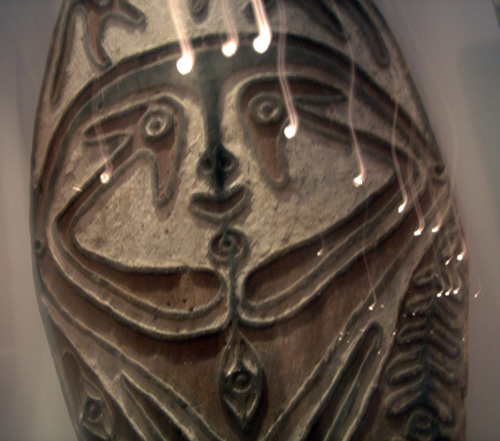
This is a spirit board; I saw a bunch of them from Papua New Guinea (PNG) in the Jolika Collection of New Guinea Art on the second floor of the DeYoung museum in SF the other day. I got a book about it, the catalog of a show called “Coaxing the Spirits to Dance,” which is at the Met in NYC untl next fall, and includes a lot of stuff from the Hood Museum of Dartmouth.
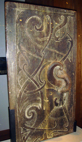
[Irrelevantly, this is a door from Borneo. Love those BZ scrolls! This is clearly a teleporation portal.]
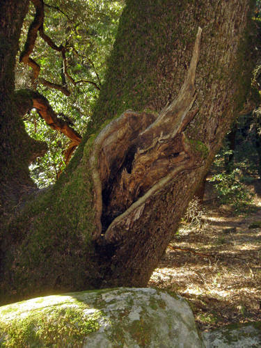
Used to be that everyone in PNG had a dugout canoe, and when the canoe wore out, they’d salvage some flat wood and carve a spirit representation on it, usually with a face and a navel. The idea was that the spirit could get into the board via the navel. The images are NOT of ancestor spirits, they’re spirits of place like, hmmm, genii loci, or beezies who’ve moved out of the orphidnet into natural computations, inhabiting gnarly spots of the physical world.
Georgia sent me an email about the year’s best fonts, and I went to MyFonts site
to look at some of the grungy or hand-made looking fonts.
You see hand-made-looking fonts on store signs, and it’ll look cute and human, but then of course you notice that, say, two 'e' s are exactly the same.
A few of the fonts, like BOYCOTT come with two versions of each letter so you can avoid the really obvious side-by-side repeats.

As a computer scientist, I’m thinking what is really needed for grunge and handwriting fonts is fonts that produces letters that vary slightly each time an instance is invoked. That is, a letter would have three or four slider parameters with lower and upper bounds so that within this letter-space each version would look reasonably good. And when you called for that letter, a random number would be picked as seed, and attached to that letter-instance in the background, and letter would use that random number to pick the instance in letter space, and when you saved it, you'd be saving the seed number, so if someone viewed it again it would look the same. And if you didn't like a letter's look when you were desigining, you could keep clicking on it and with each click the seed number would change and the letter would change a little.







January 18th, 2007 at 10:37 am
FYI, t26.com and p22.com are my fave font houses (myfonts is more of a forum, not really a font house). oh yea, and chank.com
January 18th, 2007 at 11:59 pm
The guys at House Industries (they did my font set years ago!) have developed several sets of fonts that do just what you have described!
January 19th, 2007 at 2:30 am
Another possiblity is “generative fonts”: type in text in a one or two dimensional array, then automatically run a cellular automata rule on one or more parameters.
Applying animation (via a post-production program such as AfterEffects) is a next possible step: shimmering, mutating fonts!
-=TT=-
January 22nd, 2007 at 10:01 am
My all-time favourite grungy-looking fonts are by Eduardo Recife and can be found on his website “Misprintedtype.com”. Organic gnarliness abounds in his designs. (But no randomness, sorry.)
January 22nd, 2007 at 9:37 pm
I think it’s fascinating to think about that particular ‘very long pier’ which used to be the streetcar connection to a ferry to SF before the Bay Bridge and treasure island were built. It’s extended ruins which you imaged, can be seen in google aerial extending far out in the bay, sort of pointing towards Alcatraz, as I recall. And the Pan Am clipper ship port out there on TI…that was cool. Dead transit system relics.
November 26th, 2007 at 12:11 am
maybe indigenous aboriginal native knowledge hasn’t been wiped out (by the planet-paving white aliens), but instead THEY JUST LEFT THIS WORLD. exit stage left. follow that vine!
as for transit system relics, get the 2 disk dvd for THX-1138.
November 19th, 2008 at 11:04 am
Im thinking of making something similar involving the previous letters effecting the next letter. msg me if you want to join the java