The recent issue 13.2, June, 2013 of UX User Experience: The Magazine of the User Experience Professionals Association is on the theme SF and user interfaces. It includes interviews with me and with Bruce Sterling. You can see the table of contents for free online, but you would have to pay to join the UXPA in order to read the articles online—and you may want to.
In any case I’m free to publish the interview here myself, minus the UX edits. By the way, at any time, you can find nearly all of my email interviews in my massive compilation All the Interviews, which is now up to 382 questions long.
Anyway, here’s my version of the UX interview, with thanks to Aaron Marcus for providing the questions. (I’ll leave the Q & A numbers intact from my “All the Interviews” compilation.)

Q 377. You and fellow cyberpunk SF author Bruce Sterling were featured guest speakers in my plenary panel at CHI 1992, “Sci-Fi at CHI.” We talked about computer-human-interface design ideas in science-fiction. How has the SF scene evolved over the twenty years since then?
A 377. That was a fun con, Bruce and I shared a room. You guys had a reception in the Monterey Bay Aquarium. Bruce and I were so impressed by the tanks of jellyfish that we ended up coauthoring “Big Jelly,” an SF story about giant flying jellyfish. You can find the story free online as a sample of my collection, Complete Stories, distributed via my publishing company, Transreal Books.
I see the eventual SF default as being a future in which every kind of manufactured object has been replaced by a tweaked plant or animal.
“Big Jelly” was in fact a step towards that future, in that it’s about biotweak tech rather than about silicon machinery. SF writers ought to be writing a lot of stories about biotech these days, but that hasn’t fully kicked in. There’s an atavistic drift back to space operas with giant metal ships. Like writing SF novels about chariots or wooden ships or giant cars.
A different trend is that during the last decade we saw a lot of hype about the so-called Singularity, some of it with a weirdly religious fervor. The concept is that pretty soon AI will strike it rich, and computers will be as smart as humans. And then we’ll beef up the smart computers with more memory and faster chips, and they’ll design even smarter computers—and we’ll get into one of these exponential growth things. True-believing overweight mouse-potatoes will have their arteries cleaned out by nanomachines, and they’ll upload their minds onto robot bodies—which is actually an idea that dates back to my 1982 novel, Software.
The rank and file SF writers were baffled and uneasy about the Singularity, and for awhile they were leery of writing about it. But then Charles Stross rose to the challenge in his trail-blazing novel, Accelerando, and the rest of us piled on. I even wrote a novel called Postsingular, just to leapfrog over the whole thing. The singularity is SF. We’re telling plausible lies. Postsingular is available in ebook, paperback, and a free Creative Commons edition.

Q 378. How has your own work changed in terms of user-experience issues, that is, novel ways in which computer-based communication and interaction are imagined and/or described?
Q 378. For a number of years I’ve been writing about an interface device that I call an “uvvy,” which is pronounced to rhyme with “lovey-dovey.” It’s made of piezoplastic, that is a soft computational plastic. Thomas Pynchon had a substance like this in his novel, Gravity’s Rainbow—he called it imipolex, and I use this word in, for instance, my novel Freeware, which is a part of the Ware Tetralogy, available in ebook, paperback, and in a free Creative Commons edition.
An uvvy sits on the back of your neck and interfaces with your brain via electromagnetic waves interacting with the spinal cord—most users will want to stay away from interface probes that stick into them like wires. The uvvy functions like a smart phone, but it’s activated by subvocal speech and mental commands. It sends sounds and images into your brain.

Q 379. What do you think about how SF movies and television convey user-experience innovations?
Q 379. The hoariest media cliché for user interfaces is the “face on the wall,” that is, a TV-screen-like image that’s talking to you. But even with Skype and FaceTime, people don’t really seem to very interested in videophone communication.
A rich voice signal is more intimate and expresses more. Speaking of voice, I think the greatest weakness in the current digital smartphone standard is that digital voice isn’t anywhere nearly as rich as analog voice. Often, to save channel capacity, the signal drops when you’re not talking. I feel the digital audio channel needs to be made several bytes fatter, and it needs to be a continuous connection so that you hear the stage-setting buzz of the background noise and—also very important—the sound of the other person’s breath.
You often see 3D hologram displays being used in movie visualizations, and these can be fun, although they don’t tend to age well. My favorite media interface scenes are in the 1995 movie Johnny Mnemonic, based on a William Gibson story of the same name. Keanu Reeves does these wonderful Japanese-theater-type hand-jive moves when he’s manipulating his cyberspace interface. I never understood why this movie wasn’t more popular.
[By the way, in his own interview in UX User Experience, Bruce Sterling mentions that there’s a similar—and better-known—use of gestural interface in the more recent film Minority Report.]

Q 380. Is there any particular aspect of current interface technology that you feel needs to be changed?
Q 380. It’s absurd to see people pecking at their tiny smartphone keyboards. This is so clearly a bad user interface. It’s unnatural, error-prone, isolating, and non-ergonomic.
If you’ve learned to touch type—and this should be a mandatory course in every middle school—then you can use a real keyboard without having to look at it. With a real keyboard, the words flow though your arms and onto the screen.
But there’s currently no good way to have a true keyboard on a smartphone. Sure, you can connect a portable full-size keyboard, but that’s kludgy. And you can, at least theoretically, have the device project a virtual keyboard onto your table top, but that’s going to have horrible ergonomics.
We need, I think, to take another step along the keyboard-virtualization route and get serious about having the device “see” the mock-keyboarding twitches of your fingers. At some point, a more ergonomic set of hand gestures could take hold. Along these lines, I think of the finger-squeezing interfaces that have been installed in the handle-grips of some experimental bicycles. Using your eight fingers gives you a byte per squeeze.
A different solution to the smartphone interface is to forget about hand gestures and go for voice recognition, and this technology seems to be maturing. One problem here is that you’re making noise in public, announcing texts that you might want to keep private. I do a lot of my writing on laptops in coffee shops, and I can’t imagine dictating my stories aloud—including all the corrections. I’d seem like a madman. Not that the people having cellphone conversations with earphones and dangling mikes don’t already seem dangerously insane. I suppose the next step might be to have the device lip read your subvocal speech, or pick up the vibrations from a throat mike.
I also need to say something about pointing devices—mice, track-balls, and touchpads. Over time, using any of these devices intensively is hideously damaging to your body—ask any author or programmer. It’s like a silent, unacknowledged industrial disease that attacks a relatively powerless underclass. Like black lung used to be for miners. We’ve seen demos where a computer camera tracks your eye movements and lets you point by looking. I don’t understand why this feature isn’t being perfected and rushed to market for every desktop, laptop, tablet and smartphone.
With all this said, I have a feeling that there’s some as-yet-unimagined solutions that we’ll be using in twenty or thirty years. Possibly we’ll get to an uvvy-style direct brain interface. But for sure we won’t be pecking at smartphone keys and ruining our bodies with computer mice.
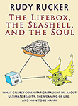
Q 381. What kind of user interface are you using in your latest novel Turing and Burroughs?
A 381. Telepathy. For me, that’s the gold standard, the interface that we’re really working towards. At a metaphorical level, telepathy stands for the dream of being perfectly understood by your friends and lovers. And we’re always getting closer.
Even though we tend to ignore this, even print is a first step towards telepathy, but time-delayed. You read this interview and you know what I’m thinking. The phone is another step. You’re speaking and listening to someone who’s far away. Speech is very intimate, very close to the roots of the mind.
An interesting aspect of full telepathy is that you can communicate info in a hyperlink style. When I have a big image to share, I don’t email the whole image, I simply send a hyperlink to the image’s location, and let the user find the image there. With telepathy, instead of wrestling some complicated thought pattern into words, you might simply send a trusted friend a “hyperlink” to the location of this thought within your brain. And possibly they can connect to you and experience the thought as if they’re having it themselves. Note also that with this style of communication no longer need to break down an image into RGB bytes, nor need you code a thought into words.
I’ve put telepathy into any number of my novels, using all sorts of SFictional gimmicks to make it work. In Turing and Burroughs, my characters experience a communicable biological mutation that makes them sensitive to a certain type of brain-generated wave. Also they can shapeshift into giant slugs and have great beatnik orgies.
As with many of my books, Turing and Burroughs is available in paperback, ebook, and free CC editions. Putting out my content. Building my brand.

[Photo by Sylvia Rucker]
Q 382. In the movie The Graduate (1967), the young hero is urged to focus on the future based on one word: plastics. If you were to guide newcomers to the world of the future, what would that one word be?
A 382. One word? Telepathy. Or a reasonable facsimile thereof. At least in terms of user interfaces.
In the tech realm, the answer is surely biotech.
And for a creative person trying to make a living, the key word might be disintermediation, that is providing your creative content directly to consumers. Self publishing, in other words. When you’re distributing things on the web, you want to avoid the various parasitic entities that might leech onto your slim income.
So, regarding the future, I’m suggesting that you be a creative content provider, and that you manage the distribution yourself. DIY, as the punks used to say.








July 28th, 2013 at 1:56 pm
Totally agree on the Johnny Mnemonic movie UI – I realised on my third or fourth reading of Neuromancer that Gibson never really gets into the specifics of how the UI on a cyberspace deck actually works, and Johnny Mnemonic seemed to me to be a really interesting interpretation. Minority Report and its ilk seem mundane by comparison.
There are virtual keyboard doodads which project a keyboard onto a flat surface and detect your typing optically. Never tried one, but I think a key (!) problem is tactile feedback – we expect keys to have some “give”, some mechanical action. Touch typing on an iPad on-screen keyboard is difficult because of this, even though its size is close enough to a real keyboard.
July 30th, 2013 at 7:04 am
Chuck Shotton writes: A couple of links to what will likely give you your “virtual keyboard through finger twitches” as you mentioned:
https://www.thalmic.com/myo/
http://www.wired.com/business/2013/02/thalmic-labs/
Karen Marcelo: Here’s a crazy user interface of the present, it reads your facial expression. http://de-bug.de/musiktechnik/archives/5044.html
August 1st, 2013 at 10:14 pm
>> At some point, a more ergonomic set of hand gestures could take hold. Along these lines, I think of the finger-squeezing interfaces that have been installed in the handle-grips of some experimental bicycles. Using your eight fingers gives you a byte per squeeze.
This is actually what blind people with smart phones do. They hold the phones backwards (so the screen is facing away from them) and press their fingers into the Braille locations. That, combined with responsive voice feedback, seems fairly natural. The new Sony portable game system has touch-screens on both sides. If it were the size of my phone, that might make for a compelling interface (because sometimes I do want to manipulate icons on a screen instead of touch-typing).